by jydesign | Sep 1, 2020 | Blog, Roundup
Updated January 14, 2021. See this twitter thread for details.
Several Web Browser apps want to make it easier for people & teams to test and develop Responsive Websites and Web applications iteratively.
These apps are different from services that offer static screen captures of web pages across various popular browser versions and operating systems. Such browser snapshot services have been around for a while and are certainly a helpful tool – especially when trying to do QA for legacy browsers that you plan to support.
In contrast, these specialized Web Browser DevTools focus on allowing Front-end devs to see a realtime synchronized view of responsive web content scrolling within multiple viewport ‘panes’ simultaneously.
This approach enables a website builder to review and compare the same design across various screen dimensions. Scanning multiple renderings all at once can help a developer iteratively fine-tune their layout to perform well on different device sizes.
While this multi-view in a single app approach may never truly replicate testing on the native target devices, such a browser can help you improve your coded results much quicker than a device lab alone.
Here’s a roundup of these unique web content viewing solutions.
Blisk
“Blisk is the first developer-oriented browser. It provides businesses with a development workspace for the teams and freelancers to develop and test modern web applications twice faster.”
Emmet Re:view
Emmet Re:view “A browser extension for displaying responsive web-pages in a side-by-side views to quickly test how it looks at different resolutions and devices.”
LT Browser by LambdaTest
LT Browser “Perform free automated and live interactive cross browser testing on 2000+ real browsers and real devices online.”
Polypane
Polypane “Improve your web dev workflow. All the tools you need to build responsive, accessible and performant sites five times faster.”
Responsively App
Responsively App “A dev-tool that helps with faster responsive web apps development. A must-have tool for all web developers. Free and Open Source!”
Sizzy
Sizzy “The browser for developers. Stop wasting time and speed up your development workflow.”
Here’s a copy of this list in an Airtable database that you can bookmark, follow or copy. If I missed any, please let me know or reply to this Twitter thread.
by jydesign | Jun 23, 2020 | Blog
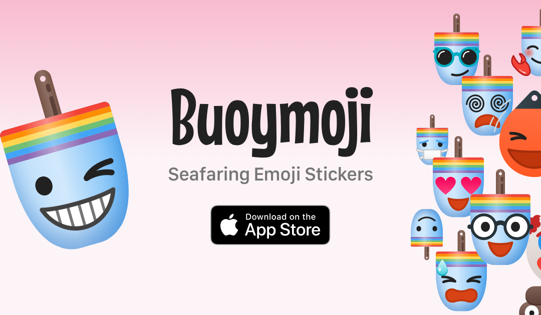
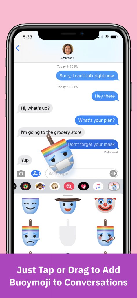 Buoymoji Rainbow is our 3rd release of Stickers for Apple iMessage on iOS. It’s available now on the Apple App Store.
This latest addition to our buoy themed emoji series includes whimsical buoys turned maritime emoji characters, with rainbow stripes and a blue-tinted body. They go well with our Basic yellow and Colorways sticker sets. Get them all for maximum variety.
The rainbow theme was inspired, in part, to support Pride Month.
Is it Buoymoji or Buoymojis? Either way, we hope you’ll have fun with this reimagining of classic emojis as traditional lobster buoys.
Take pride in adding a splash of rainbow and personality to your iMessage chats. Designed near the ocean in a seacoast suburb of Boston, MA.
A collaboration between James Young and Tim Walling

by jydesign | Feb 29, 2020 | Blog, Roundup
Updated January 18, 2021. See this twitter thread for details.
The design services landscape has undoubtedly evolved in the last decade.
Regardless of size or model, there’s been a rich history of graphic design services being a “relationships businesses.” Firms typically became known and trusted for their leadership, teams, and results. Reputation is still a factor today, but the variety of means for engaging with design practitioners continue to expand.
Outside agencies still exist and are now competing with the impulse within some companies to either build or acquire their own internal design teams. Individual freelancers and small boutique shops are looking for ways to specialize in countering these pressures. Freelancer marketplaces have been around for a while and focus on a race to the bottom in affordability.
An even more recent trend is the rise of design service companies that commoditize typical graphic and digital design production services and outputs and wrap them up in a SaaS (software as a service) styled capabilities model that offers predictability of pricing and flexibility of commitment.
The business world loves its acronyms. Perhaps this is model could be known as “On-Demand Design Services (ODDS)” or “Unlimited Design as a Service (UDaaS)” 🤓
What do these companies have in common?
- Emphasis on a tiered fixed-price model, quite similar to SaaS companies
- A contract-less monthly commitment that can be canceled any time
- Ability to increase or decrease the scale of services needed month to month
- They are usually remote-only, nobody shows up on-site to help you
- Anonymity and variety, no guarantees that you can choose or know the designer(s) working on any given project
- Proprietary online portals track all workflow processes, job requests, feedback, iterations, and sign off – asynchronously online.
- They are headquartered around the globe
- Many offer unlimited revisions
- A promise of end-product ownership (IP, files, assets)
- Some offer a “risk-free” trial period
- Some target a mix of end-customers, from companies seeking design help to other agencies and freelance designers that need immediate assistance
- Most emphasize graphic design production, NOT strategic thinking or brand creation
Here’s a copy of this list in an Airtable database that you can bookmark, follow or copy.
Disclaimer: I am not affiliated with any of the above services, nor have a had the opportunity to work directly with any of them. This article is meant for information purposes only and is not a recommendation to purchase or use these services.
If I’ve missed any related companies, or if you are a business that has hired any of these companies in the past and wish to share your experiences – please get in touch.
Illustration: productive by Becris from the Noun Project
by jydesign | Dec 2, 2019 | Blog
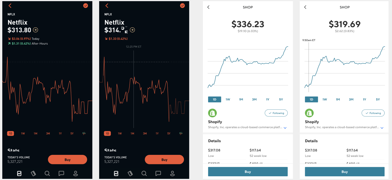
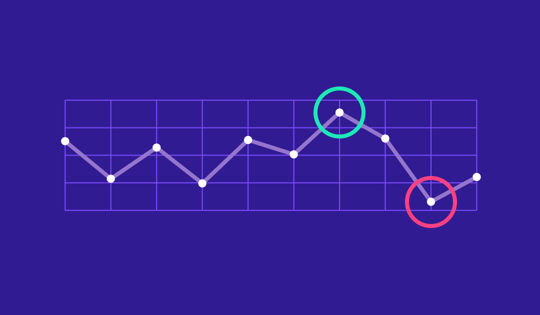
There is a ‘trendy’ design pattern, many years in use, of not displaying the Y axis on a chart in some financial mobile apps.
I first noticed this in the app Robinhood. But I’ve also seen it in apps such as SoFi. Sadly, despite advocating for a change, these apps are still persisting this flawed data visualization design.
Why is this bad?
Overall, due to the mobile format, it often makes sense to show something like a line or candlestick chart that’s closer to a square or even portrait proportion.
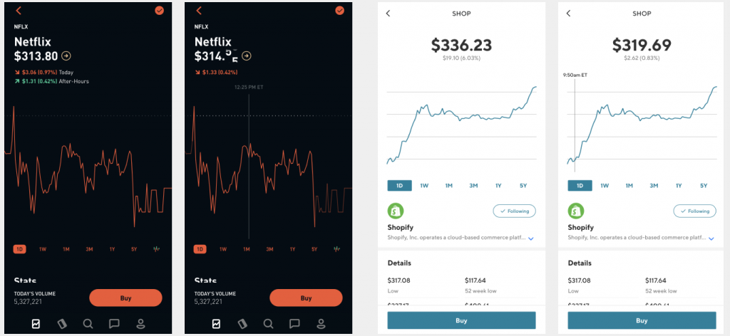
When a chart in this format presents either a narrow rang of time or a fairly stable historical trend, even minor up and down movements of only a few dollars can look like wild swings at a glance. This is why this pattern is flawed. If a user can’t quickly understand the high and low price range that is traditionally communicated by the data on the Y axis, the glance could trigger a perception of movement that’s proportionally incorrect.
Presenting data in this way will require the audience to think harder than they should have to, for no apparent functional reason. Products that use this kind of design appear to be prioritizing spontaneous conversion of their Buy/Sell buttons over helping their customers make more informed decisions.
So what’s a better way?
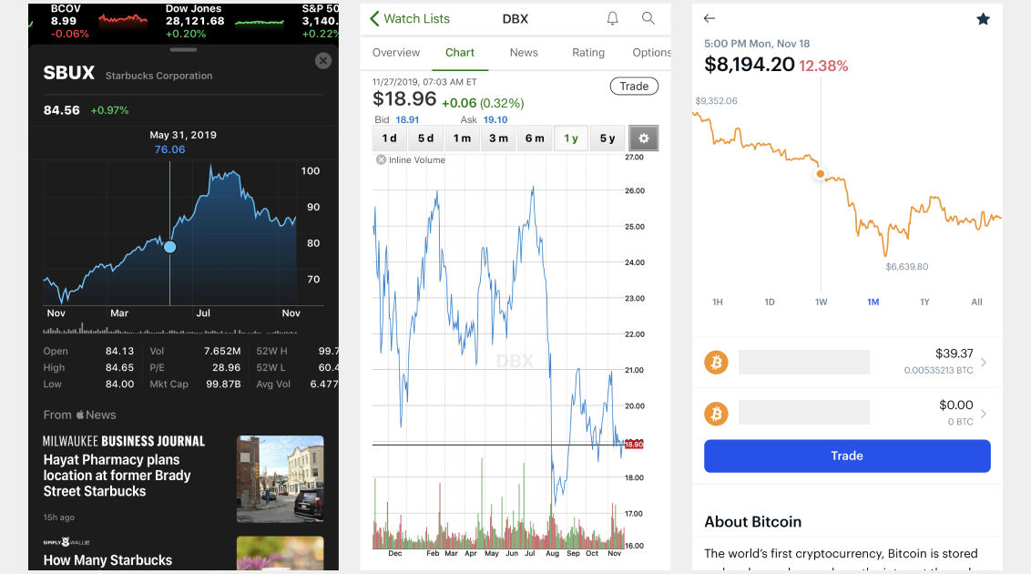
The first option is to simply include the y axis. It is possible to do this in a small space. A few examples include Apple’s iOS stocks app and TD Ameritrade. What’s notable is that both take the approach of right-aligning the display of the text labels to make it more readable and functional in a mobile setting.
The Coinbase app offers and example of the second way to approach this. You can omit the Y-axis, if you include the lowest and highest price overlaid on the chart within the relative time period. This is another useful way to give the viewer a quick way to understand the relative volatility of movement while maximizing the horizontal space that a Y-axis would otherwise inhabit.
In Summary
You can’t completely do away with the relevant data that a Y axis provides on charts just because the screen is small. Alternatively, if your motivation is to make a chart look cooler or simpler then you are fueling the “dribbblification” tropes about superficial designers who don’t understand business, usability and customer needs. Lastly, it would be even worse if you are doing this on purpose to somehow distort or add friction to an end user’s comprehension of the data – as that seems to fall into the category of dark patterns.

by jydesign | Nov 3, 2018 | Blog, Roundup
I’ve been intrigued by the potential endgame of a single environment that could satisfy the needs and modes of operation for both visual UI designers and developers. Convergence of tools has been a theme of my “Looking Ahead” new year blog entries for 2017 and 2018.
Typical UI Design tools still offer an excellent working model for quickly manifesting design ideas at any level of fidelity. Many of us know of situations where a well-executed mockup that took 30 minutes to render in a design tool (drawing pictures of screens) might get a dev estimate of many hours or days to execute (QA’d production code).
As long as that dynamic exists, many designers will continue to prefer WYSIWYG drawing tool interfaces over working directly in code – especially when they are early in the ideation process.
Popular tools like Figma, Sketch and AdobeXD continue to make moves toward exporting out to React and potentially other libraries. However, as of now, these are one-way, and the real deal will be bi-directional or zero-conversion options.
Here’s a roundup of new tools looking to shorten or even eliminate the distance between drawings of screens and production-ready code (in alphabetical order).
Alva
Alva – “Alva lets you design interactive products based on components engineered by your developers. And guess what – we are entirely open source.”
Haiku
Haiku – “Design components that snap into any codebase: Unlock your creativity with the world’s most expressive UI builder”
Interplay
Interplay – Fast prototyping that combines the power of design systems, production code components and live collaboration.”
Iterative.ly
Iterative.ly – “Iterate on top of your live app using your design system. Launch an experiment in under 10 minutes. Continuously improve your product.”
Modulz
Modulz – “The visual code editor for designing and building digital products—without writing code.”
Supernova
Supernova – “Design and development tool unlike anything you’ve experienced. #nomoresnippets – always a production-ready code.”