Web Browsers for Responsive Front-End Development & Testing
Updated January 14, 2021. See this twitter thread for details.
Several Web Browser apps want to make it easier for people & teams to test and develop Responsive Websites and Web applications iteratively.
These apps are different from services that offer static screen captures of web pages across various popular browser versions and operating systems. Such browser snapshot services have been around for a while and are certainly a helpful tool – especially when trying to do QA for legacy browsers that you plan to support.
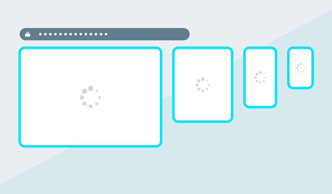
In contrast, these specialized Web Browser DevTools focus on allowing Front-end devs to see a realtime synchronized view of responsive web content scrolling within multiple viewport ‘panes’ simultaneously.
This approach enables a website builder to review and compare the same design across various screen dimensions. Scanning multiple renderings all at once can help a developer iteratively fine-tune their layout to perform well on different device sizes.
While this multi-view in a single app approach may never truly replicate testing on the native target devices, such a browser can help you improve your coded results much quicker than a device lab alone.
Here’s a roundup of these unique web content viewing solutions.
Blisk
“Blisk is the first developer-oriented browser. It provides businesses with a development workspace for the teams and freelancers to develop and test modern web applications twice faster.”
Blisk version 12 is live! Release notes: https://t.co/Kn15GCnONl
Existing users: Blisk updates automatically to the new version. New users can download the latest versions of Blisk:
Windows version: https://t.co/rsk4bpos0g
MacOS version: https://t.co/Pjow1CLRZE pic.twitter.com/AZM4ElSHne— Blisk browser (@BliskBrowser) July 2, 2019
Emmet Re:view
Emmet Re:view “A browser extension for displaying responsive web-pages in a side-by-side views to quickly test how it looks at different resolutions and devices.”
“Re:View” by @emmetio – bird’s-eye view of device-sized, fully synchronized viewports and one of my favorite browser extensions https://t.co/PxIvgzfgcV #productivity #responsive #design #webtools pic.twitter.com/OndVasRR7D
— Oksana Cyrwus (@oksanarray) July 23, 2019
LT Browser by LambdaTest
LT Browser “Perform free automated and live interactive cross browser testing on 2000+ real browsers and real devices online.”
We are thrilled to announce that LT Browser is now live on @ProductHunt!💥💥
Presenting a #Developer-friendly browser that lets you develop, test & debug responsiveness of your mobile sites on the fly.🚀
Come check us out 👉 https://t.co/FmtarQKc4L
— LambdaTest (@lambdatesting) January 13, 2021
Polypane
Polypane “Improve your web dev workflow. All the tools you need to build responsive, accessible and performant sites five times faster.”
Polypane 3.3 is out! 🎉
Overlay columns, grids & guides, detect and fix horizontal overflow-causing elements, new overlays, improved UI and faster page loads. Over 50 new features make this a release we’re very proud of. 🤩
Check it out! https://t.co/o3wfwSDquh
— Polypane (@polypane) September 1, 2020
Responsively App
Responsively App “A dev-tool that helps with faster responsive web apps development. A must-have tool for all web developers. Free and Open Source!”
This is huge! Thanks for the mention @addyosmani! 🚀🙏 https://t.co/Q4wMlTRgp6
— Responsively App (@ResponsivelyApp) July 2, 2020
Sizzy
Sizzy “The browser for developers. Stop wasting time and speed up your development workflow.”
💡 You can toggle the new tab bar with Cmd + Shift + B on macOS and Ctrl + Shift + B on Windows/Linux.
It also works in combination with Zen Mode (Z) 👌 pic.twitter.com/pLmubZHk3Z
— Sizzy – The Browser For Developers (@sizzyapp) September 1, 2020
Here’s a copy of this list in an Airtable database that you can bookmark, follow or copy. If I missed any, please let me know or reply to this Twitter thread.


