OK, bear with me for a minute on this one. So, if you’ve ever watched “Project Runway”, you will probably recall Heidi Klum’s matra of “(in Fashion) One Day You’re In & the Next Day You’re Out” – this coming from a woman who’s managed to remain a model for 20+ years on a show that’s in it’s 12th season. Ironies aside, she’s basically right.
In design, especially any kind of digital design, the trend of ‘what’s in’ is churning at an ever-increasing clip. In addition to this, there’s a growing emphasis on trends being driven by what I’m inclined to describe as a ‘swinging the pendulum’ principle. It has become vogue to swing wildly in the exact opposite direction of any trend on ascension, as if this, is in and of itself, is an aesthetic vision worthy of utmost respect. For example ‘design above the fold’ turns into ‘There is no fold.’

Extreme Swings in Website Design Trends: http://house.pl/kampania/ compared to http://motherfuckingwebsite.com
This article was basically touched off after spotting a new extreme swing, as represented by these two sites: “This is a motherfucking website.” and “Words“. These sites are actually very interesting and useful, because they are stand-outs abuzz on twitter – for the moment. They are created by intelligent folks as sign posts or warnings – don’t blindly worship at the altar of design fad X, and lose sight of principles Y and Z. They are extreme aesthetic reactions to the perceived negative side-effects of well intentioned, but increasingly popular design trends, spawning a wake of crap in their hapless application by folks who may have temporarily lost sight of what’s important.
But that’s about it, because otherwise these two sites kind of stink as holistic examples of engaging ‘design’ (be honest). So please, don’t embrace them as a trend or framework of their own. They look like the draft designs I was previewing in Mosaic for Unix back in 1993. People don’t want the web of 1993, any more than they want a responsive site to take 2+ min to load on their smartphone. It’s our job to deliver something “new” without regressing to antiquated kitsch.
If you are a designer (visual, UX, CX, whatever), it’s never been more important to hold true to foundational values of user-centered design. This challenge isn’t new, but we are facing a rather unique type of perfect storm that involves fickle end-users, highly competitive market segments, and ‘revolutionary’ design frameworks coming on the scene looking for converts.
You can’t just be trendy, you have to nail the entire customer experience. Yup, you are of course expected to “do it all” – perfect responsive site design (app/whatever), with fantastic content, unique look and feel, and it must score perfectly on Google’s PageSpeed Insights. You know, “the usual”.
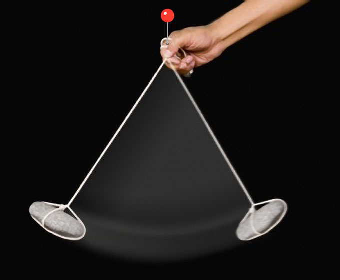
So, when it comes to design trends that swing wildly & quickly from one extreme to the next, be The Hand. Sit above it all, looking down on the pendulum, gleaning from ‘the now’, that which is interesting and effective, while holding true to timeless user-centered design principles that have become ingrained with experience.