Talking about mobile “booking” of appointments on the Pingup Blog

I contributed an entry to the Pingup blog regarding the online booking of appointments (web and mobile). Read the full article here…
I contributed an entry to the Pingup blog regarding the online booking of appointments (web and mobile). Read the full article here…
OK, bear with me for a minute on this one. So, if you’ve ever watched “Project Runway”, you will probably recall Heidi Klum’s matra of “(in Fashion) One Day You’re In & the Next Day You’re Out” – this coming from a woman who’s managed to remain a model for 20+ years on a show that’s in it’s 12th season. Ironies aside, she’s basically right.
In design, especially any kind of digital design, the trend of ‘what’s in’ is churning at an ever-increasing clip. In addition to this, there’s a growing emphasis on trends being driven by what I’m inclined to describe as a ‘swinging the pendulum’ principle. It has become vogue to swing wildly in the exact opposite direction of any trend on ascension, as if this, is in and of itself, is an aesthetic vision worthy of utmost respect. For example ‘design above the fold’ turns into ‘There is no fold.’

Extreme Swings in Website Design Trends: http://house.pl/kampania/ compared to http://motherfuckingwebsite.com
This article was basically touched off after spotting a new extreme swing, as represented by these two sites: “This is a motherfucking website.” and “Words“. These sites are actually very interesting and useful, because they are stand-outs abuzz on twitter – for the moment. They are created by intelligent folks as sign posts or warnings – don’t blindly worship at the altar of design fad X, and lose sight of principles Y and Z. They are extreme aesthetic reactions to the perceived negative side-effects of well intentioned, but increasingly popular design trends, spawning a wake of crap in their hapless application by folks who may have temporarily lost sight of what’s important. (more…)
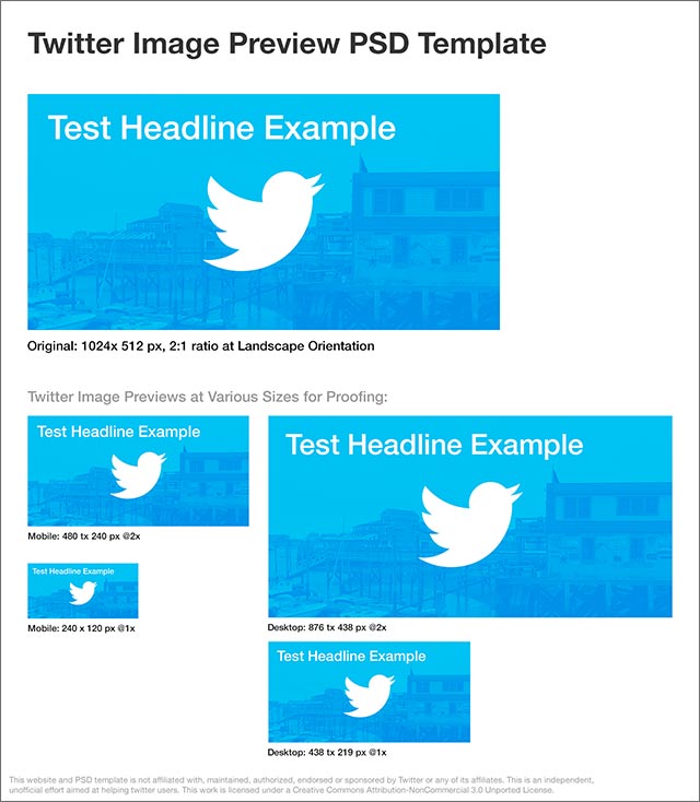
Optimize your pictures for best display within new Twitter image previews
Twitter has updated it’s various feeds (on the web, and in its mobile and desktop apps) to allow for displaying a partial preview of images. While the value of this is being debated by some, this particular article is aimed at folks who wish to take advantage of this new feature by optimizing the initial preview of their inline images.
Twitter inline images display as a landscape-oriented ‘preview’ of your attached picture right in the main feed, regardless of whether or not your full size image is in a landscape or portrait orientation. If you tap or click on an image, it ‘opens’ for viewing at full size. Twitter has confirmed that they are using a simple 2:1 fixed ratio to create uniform sized previews:
Tip: If you want your entire image to be visible in the Tweet preview, use a horizontal image w/ a 2:1 aspect ratio (e.g. 1024 X 512 pixels)
https://twitter.com/TwitterSmallBiz/status/403915826928967680
— Twitter Small Biz (@TwitterSmallBiz) November 22, 2013
While they have shared the above details, I’ve yet to track down specifics regarding the vertical positioning of cropped images and if they are simply centered, or if their position is random. Test on various devices, so far, seem to point more to a random Y-axis positioning.
What does this mean for savvy Twitter marketers?
Well, if your followers are going to see these images, you may wish to control what appears within the initial preview area. If your goal is to present a coherent message right in the preview, without requiring a user to ‘open’ it to full view, you can simply produce horizontal artwork at the fixed 2:1 landscape ratio. This will ensure that any text copy, or significant aspects of your image, will appear immediately – and not get cropped out of view in the preview. Don’t assume that people will tap on your image preview to see the entire thing – if you have a written message to communicate, you are best off using a fixed-size picture at this ratio.
We’ve been working away on a number of efforts at Pingup and are now able to start sharing some of our high-level thinking in some recent blog posts. I wrote one that briefly describes our work toward creating a common UX for multiple types of ‘Scheduling’ activities. Here’s a snippet:
In looking at the challenge, we have been exploring how scheduling and transactional flows can be broken down into a series of similar high-level steps. While we realize that there will be nuances to the flows of different types of venues, our aim is to provide a consistent UX within our app for a variety of booking scenarios. Consistency doesn’t have to equal one-size-fits all, but the re-use of common UI patterns provides the benefit of familiarity. When our users open the Pingup app, scheduling a haircut, a dinner reservation or a mixed martial arts class should all have the same easy “feel”.
We are constantly refining our approach to helping users take immediate action, but here’s our current take. There are essentially 5 major steps as illustrated in this early App flow diagram.

Read the entire article, titled “One Scheduling Flow to Rule Them All” on the Pingup Blog…

Just a quick post to celebrate an app I’ve also tweeted about a few times before. We use Reflector for many things at Pingup. It’s great for things like:
Check it out if you haven’t already by visiting http://www.airsquirrels.com/reflector/. The next app I hope to write about soon is Sketch and it’s companion mobile apps…