Sometimes the analog approach is a quicker and easier way to achieve a particular design thinking task.
A classic example is the appropriately stereotypical use of sticky notes by User Experience designers to facilitate various design thinking workshop exercises such as card sorting and other ideation models. The ability to quickly write-out and rearrange notes keeps the ideas flowing.
After your effort has wrapped up, there’s often a desire to capture the analog results in a digital format. Transforming analog work to a digital copy allows a team to move toward the next phase of sharing or synthesis.
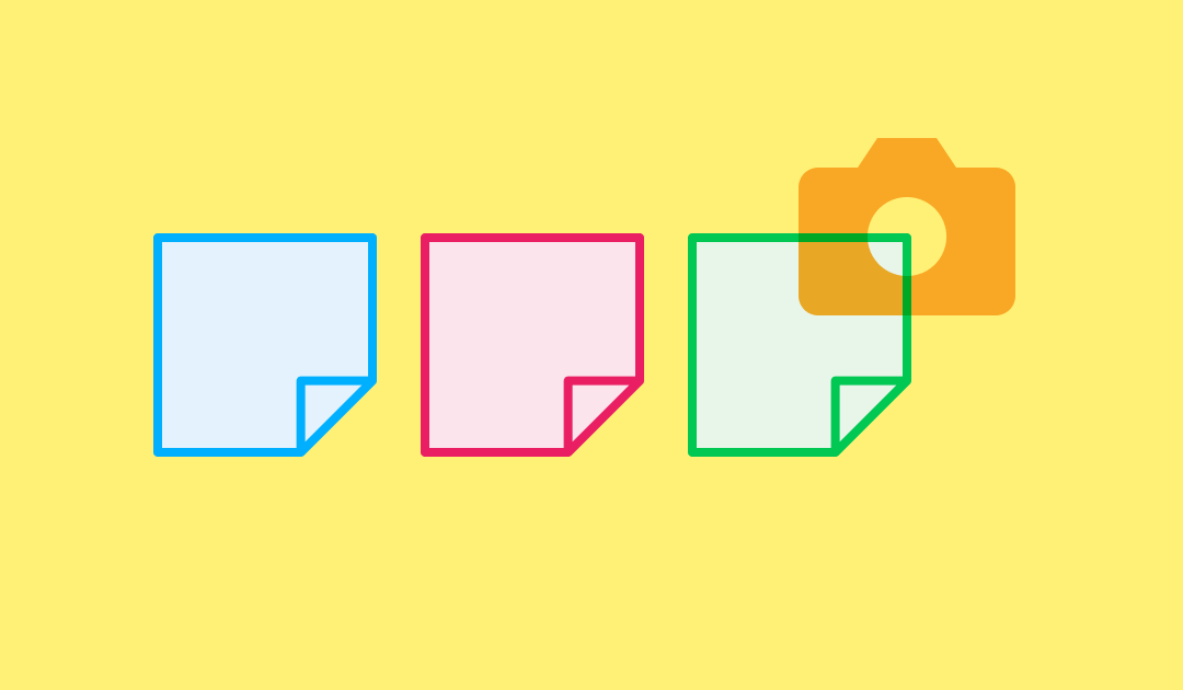
Here are some useful apps that can help quickly capture and convert photos of your hand written “Post-it®” sticky notes to editable text.
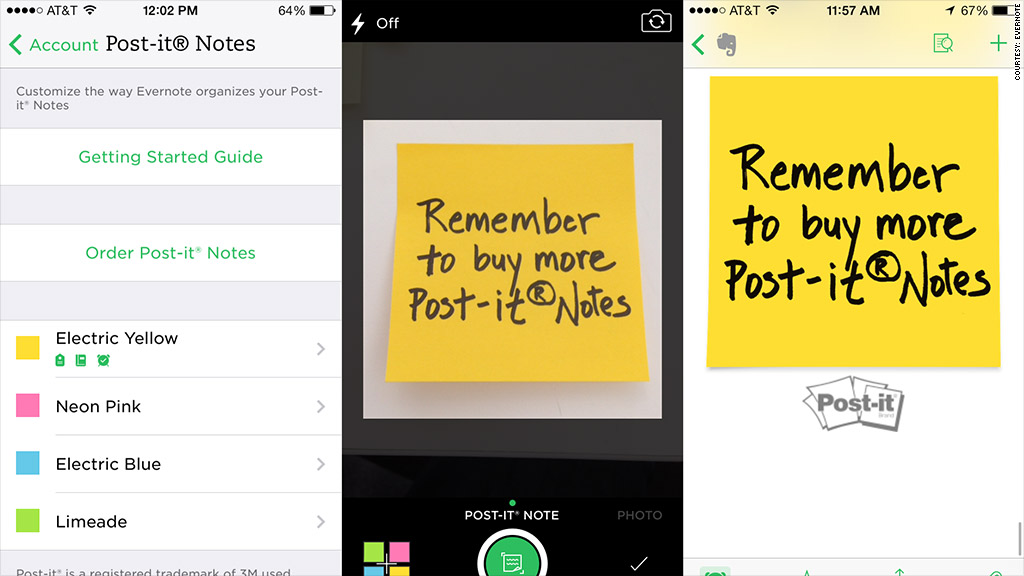
The Post-it® App
From the brand you know and love. “The Post-it® App brings the simplicity of the Post-it® Note to your Mac, iPhone and iPad. Whether you use Post-it® Notes for collaboration or for personal note taking, the Post-it® App helps you keep that momentum going.
Simply capture analog notes from a photo, or create new notes right on your device for those important reminders. Arrange, refine and organize notes and ideas on your board anyway you see fit. Then share your organized board with friends and co-workers, or export to your favorite applications and cloud services—including Trello, PowerPoint, Excel, PDF, Dropbox, iCloud and plenty more.”
Brill
Brill is an app that promises to help you digitize faster and work smarter “take photos of multiple handwritten sticky notes and instantly convert them to digital text in 100+ languages. Up to 200x faster than typing.”
“Save time when capturing your handwritten notes. Share to email, Slack, Jira, Trello and more!” With auto-detection and bulk uploading, Brill can “Take photos of multiple handwritten sticky notes and instantly convert them to digital text in 100+ languages. Up to 200x faster than typing.”
Miro
Miro is your team’s centralized platform for collaborating on user story and customer journey maps, workflows, and more.
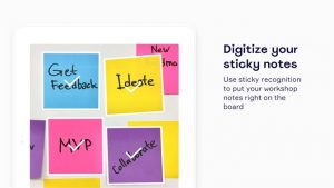
One feature is a “Stickies Capture tool allows you to convert real stickies to fully editable Miro sticky notes. Share them and collaborate in real-time, turn them into Jira tasks or make a part of digital diagrams, templates, and more.”
Evernote
Evernote lets you “Take notes anywhere. Find information faster. Share ideas with anyone. Meeting notes, web pages, projects, to-do lists”
“The Evernote camera is specially designed to enhance and transform your Post-it® Notes into beautiful, digital replicas of all your notes.”
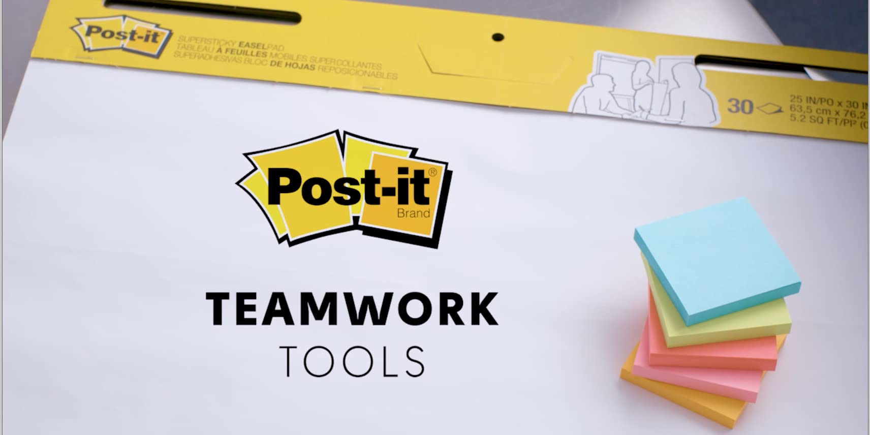
Stock Up on The Real Thing!
Post-it® Teamwork Tools are the actual Post-it notes, large notepads, and other physical supplies that can help you facilitate your UX and Design workshop sessions.
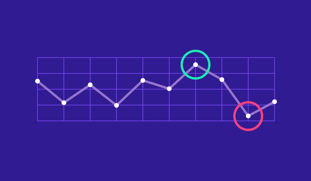
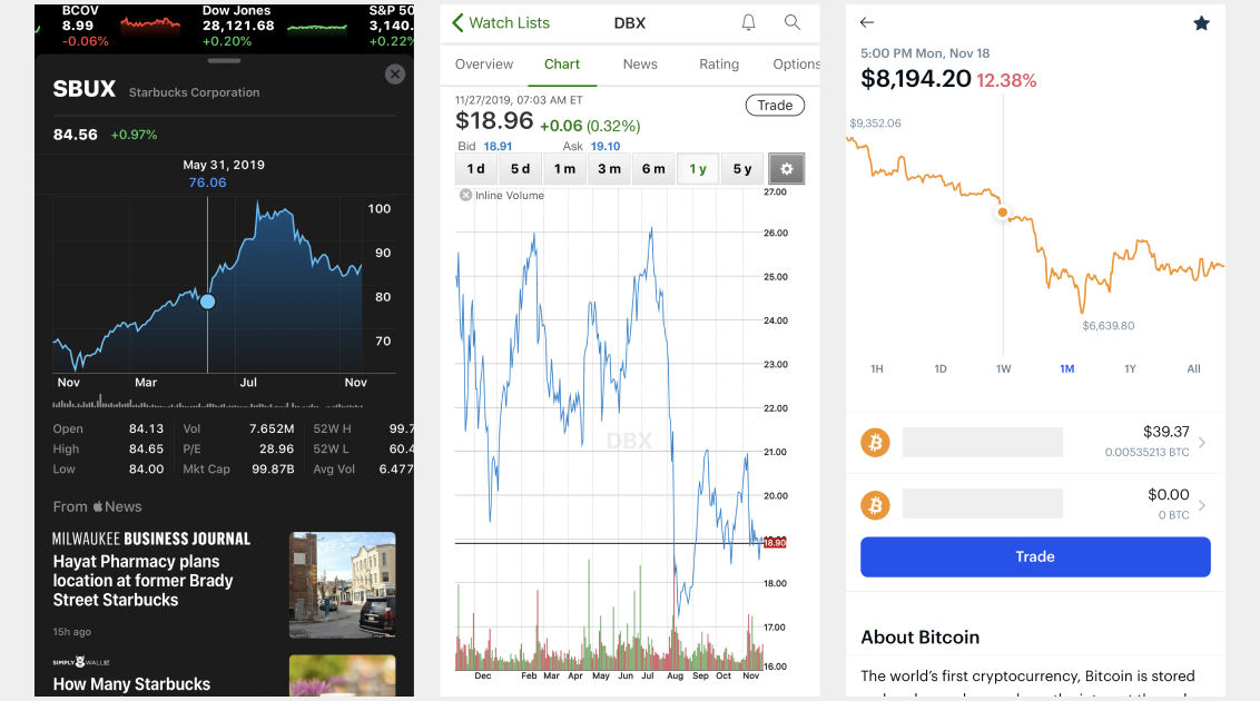
There is a ‘trendy’ design pattern, many years in use, of not displaying the Y axis on a chart in some financial mobile apps.
I first noticed this in the app Robinhood. But I’ve also seen it in apps such as SoFi. Sadly, despite advocating for a change, these apps are still persisting this flawed data visualization design.
Why is this bad?
Overall, due to the mobile format, it often makes sense to show something like a line or candlestick chart that’s closer to a square or even portrait proportion.
When a chart in this format presents either a narrow rang of time or a fairly stable historical trend, even minor up and down movements of only a few dollars can look like wild swings at a glance. This is why this pattern is flawed. If a user can’t quickly understand the high and low price range that is traditionally communicated by the data on the Y axis, the glance could trigger a perception of movement that’s proportionally incorrect.
Presenting data in this way will require the audience to think harder than they should have to, for no apparent functional reason. Products that use this kind of design appear to be prioritizing spontaneous conversion of their Buy/Sell buttons over helping their customers make more informed decisions.
So what’s a better way?
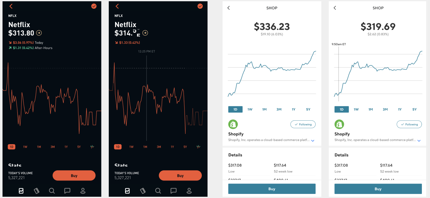
The first option is to simply include the y axis. It is possible to do this in a small space. A few examples include Apple’s iOS stocks app and TD Ameritrade. What’s notable is that both take the approach of right-aligning the display of the text labels to make it more readable and functional in a mobile setting.
The Coinbase app offers and example of the second way to approach this. You can omit the Y-axis, if you include the lowest and highest price overlaid on the chart within the relative time period. This is another useful way to give the viewer a quick way to understand the relative volatility of movement while maximizing the horizontal space that a Y-axis would otherwise inhabit.
In Summary
You can’t completely do away with the relevant data that a Y axis provides on charts just because the screen is small. Alternatively, if your motivation is to make a chart look cooler or simpler then you are fueling the “dribbblification” tropes about superficial designers who don’t understand business, usability and customer needs. Lastly, it would be even worse if you are doing this on purpose to somehow distort or add friction to an end user’s comprehension of the data – as that seems to fall into the category of dark patterns.
Hey @RobinhoodApp, the @coinbase iOS app has an elegant solution for communicating relative h/l variations in price without including full Y axis labels, you should copy this because it improves glanceability pic.twitter.com/P5sBDdK0P1
Updated January 16, 2021. See this twitter thread for details.
What is a “Presentation” in the post-PowerPoint era?
There’s a subtle shift in the Presentation tools landscape that’s been emerging lately. Products like Google Slides, Zoho Show, and Apple Keynote came on the scene to liberate us from the monopolistic shackles of the ubiquitous Microsoft “.PPT”. Now, these tools have also matured into front-runners vulnerable to disruption.
There appears to be a new wave of tools that are moving beyond competing with other “Slide Deck” software, and are instead looking to shift our perspectives on how we craft and present our stories.
The approach varies among these contenders. However, there appear to be some notable themes among them.
Collaboration – making it even more seamless to simultaneously work together on content
Assistance – clever ways that a tool can help you craft the right content or visuals (yes, we’re talking the #Ai buzzword here)
Design Magic – upping the game in offering out of the box modern charts, graphs and infographics ‘templates’ to help non-designers quickly create great data visualizations
In Your Browser – many are SaaS web apps delivered via your web browser, so no clunky downloads or files to save
Here’s a roundup of compelling products to try out or keep an eye on.
Beautiful.ai
Beautiful.ai “Add content and watch your slides adapt. No more tweaking text boxes or lining up arrows at 2am. Our Ai applies the rules of great design in real time, so it’s finally easy to tell your story”
Canva “Design a presentation that blows your audience away with our stunning collection of high-quality presentation templates. Free to personalize and completely online so you can easily edit and collaborate with your colleagues.”
Deckset “Turn your Markdown notes into beautiful presentations. Write down your thoughts in your favourite text editor, and Deckset will turn them into beautiful presentations.”
Infogram “Create engaging infographics and reports in minutes. Infogram is an intuitive visualization tool that empowers people and teams to create beautiful content.”
Ludus “We believe that static presentations are a thing of the past. Ludus is a powerful web application that lets you integrate all the power of the Internet into your slides. This means you can embed 3D models, videos, VR experiments, Dropbox files, designs from Figma, prototypes from Framer, InVision or Marvel. It’s as easy as copy and paste.”
We’ve improved many things in the last few months. Here’s what’s new. https://t.co/4yrfkYTYfv
Piktochart “Easy-to-Use presentation maker. No complex design software. No heavy designer fees. Just a simple, intuitive tool that helps you and your team tell stories with the visual impact they deserve.”
Exciting announcement to start the month of October as we’ve just released #socialmedia templates on Piktochart! With more than 200 templates, you can now create beautiful visuals for your project and share them across your favorite social media channels. https://t.co/xowJ4WvRM3
PRESENTA “enables the content-first principle. Instead of starting positioning elements on the canvas, it’s better writing great contents first. This seems obvious but the current status-quo of the presentation tools forces people the other way around.”
Love the design philosophy behind this new slide/presentation tool called #Presenta.
Projector “When you have a story to tell, Projector is the platform that helps you craft it. From live presentations to Instagram stories, Projector gives you the creative power to captivate an audience — no design skills required.”
A little sneak peek of what we’ve been working on. Whether you’re a marketer, a designer, an educator, or a student, Projector gives creators of any kind a space to bring your ideas to life. 💫
Slideas “Slideas is the easiest way to create a beautiful Markdown Presentation, with all the features you need. Designed for people who want productivity.”
Slidebean “AI-powered presentation design. Design professional presentations in seconds using the world’s first slide design platform powered by Artificial Intelligence.”
Speed up your design process with out latest feature: Create a custom theme based on your website in just one click. Try it out in the app! 🎉 pic.twitter.com/vnPh7krgO2
Slides “AI-powered presentation design. Design professional presentations in seconds using the world’s first slide design platform powered by Artificial Intelligence.”
🚀 Now you can change the color of your SVG images right from the Slides editor! pic.twitter.com/6Kav5dD9Fd
Visme “The only design tool you’ll need to present stories and translate boring data into stunning presentations for infographics right in your browser.”
A hex map is a data representation of a map but the regions are turned into hexagon shapes.
Wunderpresentation “enables you to instantly run stunning presentations that bear in mind of your audience. Automatically compiled from your structured text.”
Starting a new business or documenting an existing one?
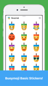
Excited to announce that you can now download our Buoymoji Basic free sticker set on the Apple App Store for iMessage.
Add some seafaring flair to your conversations with Buoymoji! Check out our pack of 80+ buoys turned emoji for messages. Designed near the ocean in a seacoast suburb of Boston, MA.
Is it Buoymoji or Buoymojis? Either way, we hope you’ll have fun with this reimagining of classic emojis as traditional lobster buoys.
A collaboration between James Young and Tim Walling
Figma recently released plugins capability to all customers. It arrived as a marketplace built right into the web app, and with a healthy inventory of options already in place. I see this as an overall positive thing. That said, I still stand by an earlier comment I made, defending Figma when they didn’t have plugins at the time:
Having moved from Sketch, I do NOT miss plugins. I miss some functionality Sketch plugins offered but often wished that was just native to the app. Over time, plugins had become a liability, a house of cards almost guaranteed to fall every new Sketch update, tread carefully…
I still hope and expect that Figma will continue to focus on adding to and improving their core product. I personally don’t like it when productivity features, that might be better implemented directly into the app, become permanently outsourced to third-party plugins. For me, these would be things like art board clean up, layer organization, export options, flowcharting, even color contrast measurement (sorry Stark et al).
On the other hand, plugins like the ones by the Noun Project and Unsplash are exactly the kinds integrations that are best delivered this way.
I have also been concerned in the past about Sketch and any other app that cultivates an ecosystem of plugins, then later natively builds and usurps a popular plugin’s capability by updating their app with that feature while not somehow compensating or quasi-acquiring that plugin as a sign of gratitude toward the third party developers who helped uncover expanded functionality that customers love.
Without a repeatable/known incentive structure in place, the motivation for an indie to keep up dev over time without compensation, does not seem scalable and/or is biased toward ‘integration’ plugins to peer products 3/3
I hope that Figma and Sketch might be thinking about how to better incentivize and reward the developers of popular add-ons as they move forward in this next chapter for design tool plugins.
Artwork credits: Outlet by Srinivas Agra from the Noun Project; add on plugin by vigorn from the Noun Project
 From the brand you know and love. “The Post-it® App brings the simplicity of the Post-it® Note to your Mac, iPhone and iPad. Whether you use Post-it® Notes for collaboration or for personal note taking, the Post-it® App helps you keep that momentum going.
 Miro is your team’s centralized platform for collaborating on user story and customer journey maps, workflows, and more.